ESB Networks announced last week that over 100,000 rooftop solar microgenerators have now been connected to the grid, totaling more than 400MW in capacity. We at Green Collective have been tracking generation from utility-scale solar farms for a while, but domestic solar generation has been a missing piece in our analysis due to a lack of data transparency in this area. As the capacity of rooftop solar combined with solar farms approaches 1GW, we believe it’s time to try to illustrate the impact of domestic solar generation.
As far as we know, generation data on solar micro-generators in Ireland is not yet publicly available. The breakdown of domestic solar generation used for self-consumption vs. feeding back into the grid is also not public information. However, since a significant portion of solar micro-generation goes to self-consumption by households, we would expect to see a dip in demand during the day - especially during the hours when solar is abundant.
Ireland saw multiple utility-scale solar records around the summer solstice: Wednesday June 19 currently holds the record for the most utility-scale solar generation at 5.3GWh, while June 18 had 3.2GWh and June 20 had 3.9GWh. On June 21, storms and cloudy conditions moved in, resulting in much lower generation from solar farms at 2.1GWh.
Assuming domestic solar capacity is 400MW and follows an output profile similar to solar farms, the chart below shows our estimated levels of domestic solar generation from June 18 to June 21. The chart also shows ROI demand curves during those days. There clearly have been dips in the demand curve during the peak solar period of 10am-4pm on high solar days. When solar generation dropped on Friday June 21, we see peak demand in the early afternoon rather than in the early evening like the other days due to the lack of domestic solar supplementing demand.
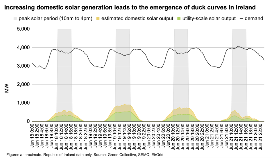
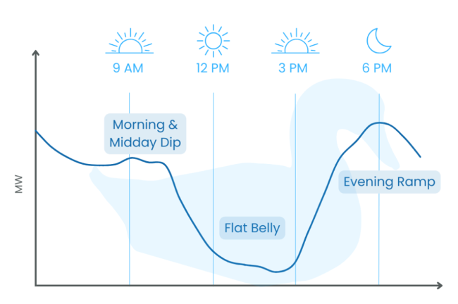
The afternoon dips in demand curves on high solar days also help illustrate the timing imbalance between peak demand and peak solar generation. This is known as a duck curve: imagine the dip during peak solar periods becomes even lower thanks to more domestic solar microgenerators, a little like a duck’s belly. Also, the evening ramp-up to peak demand becomes steeper followed by a slight decrease afterwards - a rudimentary outline of a duck’s neck and beak. It’s not a perfect analogy but it’s a commonly used one in the energy industry. Here is an illustration for context:
This is just our first attempt at estimating domestic solar generation in Ireland but even the roughest estimate clearly illustrates the significant impact of solar microgeneration on peak demand already. As more solar capacity - both utility-scale and behind-the-meter - connects to the grid, we will see more prominent duck curves. The increasing supply of renewable energy during the day while demand lowers as a result of more domestic solar also highlights the importance of more energy storage capacity. The emergence of the duck curve also calls for market mechanisms to strategically enable storage resources to soak up cleaner electricity during the day and dispatch them in bulk to meet peak demand.